Overview
As the design system grows, so does its complexity, and that’s when things can get intricate. Sometimes it’s difficult to discern in which group a specific component should go.
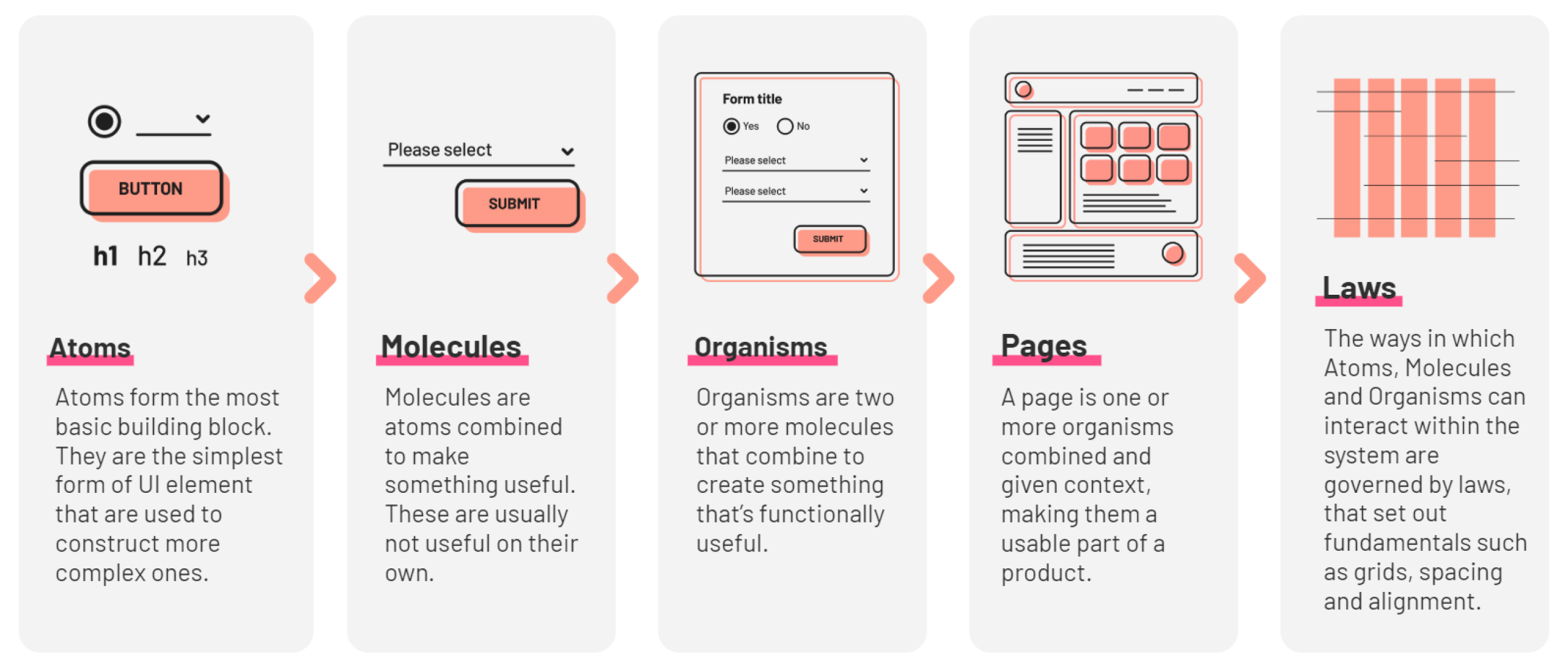
Atomic Design states groups all components into:
Atoms, Molecules, Organisms, Templates and Pages.
Atom
Populating the atoms group, it’s usually the easiest part. The rule of thumb is, if you can’t divide without it becoming useless, then it’s an atom.
Here’s a list of typical atoms:
Typographic styles
Color swatches
Icons
Radio buttons
Checkboxes
Sliders
Toggles
Profile pictures placeholders
Product pictures placeholders
Buttons
Links
Input fields (without labels)
Tabs
Pills
Badges
Tags
Tooltips
Molecule
Molecules can often be mistaken for organisms and vice-versa. The rule of thumb here is groups of atoms that work as a single component with a single function.
Here’s a list of common molecules:
Dropdown menus
Radio buttons inside
regular buttons
Dropdown buttons
Date pickers
Search components
Blockquotes
Breadcrumbs
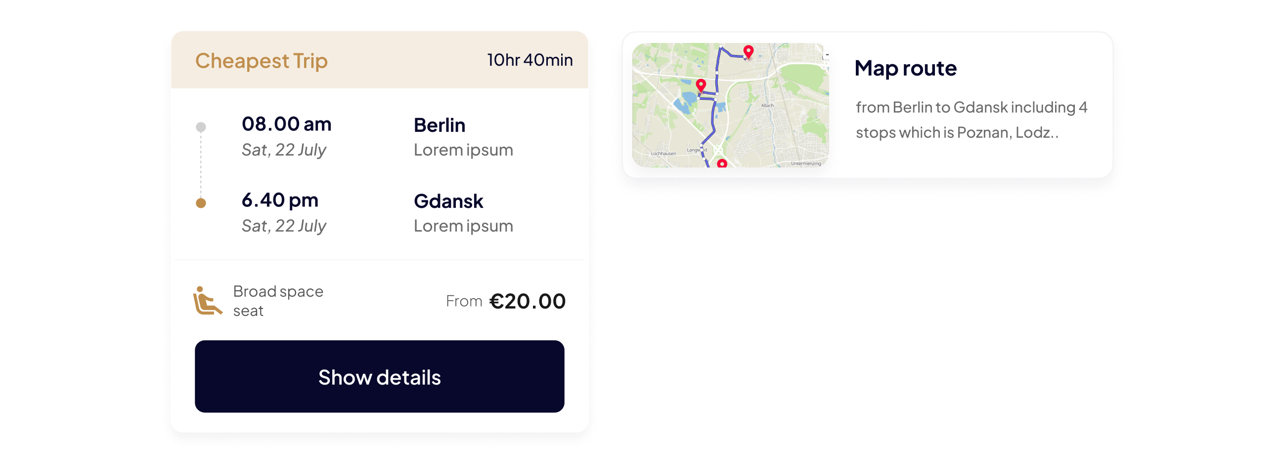
Card components
Collapsible group items
Input fields (with labels)
Media uploaders
Loading components
Notifications
Pagination
Media objects
Informative pop-ups
Boolean modals
Organısm
Now that we’ve defined the classifying principle for molecules, all you need to remember is that organisms are combinations of multiple molecules and have more than one function.
Here are some organisms:
Navigation bars
Tab bars
Video players
Music players
Media grids
Progress indicator
Tables
Carousels
Forms
Pages
Pages are the final stage of the Atomic Design Methodology.
This is where instance of templates are created.
Laws
Laws are the ways in whic Atoms, Molecules, Organism can interact withing the system.
This is where UI/UX design comes into play, and at the core of it lies the grid system. A grid is made up of columns, gutters, and margins that provide a structure for the layout of elements on a page. There are three common grid types used in websites and interfaces: column grid, modular grid, and hierarchical grid.
